Using css animations
Содержание:
Анимируйте неанимируемые свойства в keyframes
Вы, конечно, подумали, что это шутка. Все знают, что нет смысла анимировать то, что анимировать нельзя по определению. И в вакууме – да, вы правы. Но на практике бывают моменты, когда мы таки можем поменять какое-то неанимируемое свойство и получить от этого эффект, которого по другому не добиться никак.
На самом деле тут происходит некоторая игра слов – например свойство visibility формально является “анимируемым”, но по факту мы не можем плавно перевести его значение из одного в другое. Так что здесь мы говорим скорее о свойствах, которые “нельзя плавно изменить”.
Поведение неанимируемых свойств в keyframes плохо поддается систематизированию. По идее они должны меняться в конце анимации или в конце фрейма, после которого их поменяли, но на практике в разных браузерах это может происходить по-разному, особенно если мы говорим про IE/Edge, который нет-нет да и встречается в требованиях. Да и у Safari бывают свои тараканы в голове. Видимо светлое будущее еще не наступило. Так что, во избежание встречи с разными редкими багами, воспользуемся небольшой уловкой.
Для того, чтобы точно знать, когда наше значение изменится, нам понадобится ограничить промежуток времени, на котором будет происходить изменение его значения. Так, вне зависимости от поведения браузера, мы получим, что оно поменяется плюс-минус в тот же миг, что и нужно нам.
Для начала небольшой пример, как это вообще возможно. На примере z-index:
Здесь мы прямо посреди анимации создаем два фрейма на расстоянии 1% от анимации и меняем значение неанимируемого свойства
Нам не так важно, как там браузер решит – поменять его в конце, в середине, или даже в начале второго фрейма – при расстоянии в 1% мы никогда не заметим разницу. Останется только найти в анимации момент, когда этот переход не будет бросаться в глаза
В качестве примера возьмем вот такую абстрактную штуку:
Обратите внимание на то, как точки уходят друг под друга по очереди. Без изменения z-index мы бы не смогли получить такой эффект
Это, разумеется, надуманный эксперимент, но и на более приземленном сайте может возникнуть ситуация, когда нам нужно какое-нибудь уведомление сначала вывести над каким-то элементом, а потом убрать под него, и там такой прием будет очень кстати.
Что такое CSS анимация?
Как и CSS свойство плавных переходов transition, о котором мы говорили в предыдущем уроке, свойство animation призвано сделать нашу верстку более динамичной, оживить её для лучшего взаимодействия с пользователем и создания WOW эффекта.
Но в отличие от CSS переходов, создание анимации базируется на ключевых кадрах @keyframes, которые позволяют автоматически воспроизводить и повторять эффекты на протяжении заданного времени, а также приостанавливать анимацию по определенному событию.
Другими словами, использование конструкции animation и @keyframes позволяет нам создавать более сложные сценарии анимаций.
Шпаргалка CSS свойств, которые можно анимировать
- -moz-outline-radius
- -moz-outline-radius-bottomleft
- -moz-outline-radius-bottomright
- -moz-outline-radius-topleft
- -moz-outline-radius-topright
- -webkit-line-clamp
- -webkit-text-fill-color
- -webkit-text-stroke
- -webkit-text-stroke-color
- all
- backdrop-filter
- background
- background-color
- background-position
- background-size
- border
- border-bottom
- border-bottom-color
- border-bottom-left-radius
- border-bottom-right-radius
- border-bottom-width
- border-color
- border-end-end-radius
- border-end-start-radius
- border-image-outset
- border-image-slice
- border-image-width
- border-left
- border-left-color
- border-left-width
- border-radius
- border-right
- border-right-color
- border-right-width
- border-start-end-radius
- border-start-start-radius
- border-top
- border-top-color
- border-top-left-radius
- border-top-right-radius
- border-top-width
- border-width
- bottom
- box-shadow
- caret-color
- clip
- clip-path
- color
- column-count
- column-gap
- column-rule
- column-rule-color
- column-rule-width
- column-width
- columns
- filter
- flex
- flex-basis
- flex-grow
- flex-shrink
- font
- font-size
- font-size-adjust
- font-stretch
- font-variation-settings
- font-weight
- gap
- grid-column-gap
- grid-gap
- grid-row-gap
- grid-template-columns
- grid-template-rows
- height
- inset
- inset-block
- inset-block-end
- inset-block-start
- inset-inline
- inset-inline-end
- inset-inline-start
- left
- letter-spacing
- line-clamp
- line-height
- margin
- margin-bottom
- margin-left
- margin-right
- margin-top
- mask
- mask-border
- mask-position
- mask-size
- max-height
- max-lines
- max-width
- min-height
- min-width
- object-position
- offset
- offset-anchor
- offset-distance
- offset-path
- offset-position
- offset-rotate
- opacity
- order
- outline
- outline-color
- outline-offset
- outline-width
- padding
- padding-bottom
- padding-left
- padding-right
- padding-top
- perspective
- perspective-origin
- right
- rotate
- row-gap
- scale
- scroll-margin
- scroll-margin-block
- scroll-margin-block-end
- scroll-margin-block-start
- scroll-margin-bottom
- scroll-margin-inline
- scroll-margin-inline-end
- scroll-margin-inline-start
- scroll-margin-left
- scroll-margin-right
- scroll-margin-top
- scroll-padding
- scroll-padding-block
- scroll-padding-block-end
- scroll-padding-block-start
- scroll-padding-bottom
- scroll-padding-inline
- scroll-padding-inline-end
- scroll-padding-inline-start
- scroll-padding-left
- scroll-padding-right
- scroll-padding-top
- scroll-snap-coordinate
- scroll-snap-destination
- scrollbar-color
- shape-image-threshold
- shape-margin
- shape-outside
- tab-size
- text-decoration
- text-decoration-color
- text-decoration-thickness
- text-emphasis
- text-emphasis-color
- text-indent
- text-shadow
- text-underline-offset
- top
- transform
- transform-origin
- translate
- vertical-align
- visibility
- width
- word-spacing
- z-index
- zoom
CSS Reference
CSS ReferenceCSS Browser SupportCSS SelectorsCSS FunctionsCSS Reference AuralCSS Web Safe FontsCSS Font FallbacksCSS AnimatableCSS UnitsCSS PX-EM ConverterCSS ColorsCSS Color ValuesCSS Default ValuesCSS Entities
CSS Properties
align-content
align-items
align-self
all
animation
animation-delay
animation-direction
animation-duration
animation-fill-mode
animation-iteration-count
animation-name
animation-play-state
animation-timing-function
backface-visibility
background
background-attachment
background-blend-mode
background-clip
background-color
background-image
background-origin
background-position
background-repeat
background-size
border
border-bottom
border-bottom-color
border-bottom-left-radius
border-bottom-right-radius
border-bottom-style
border-bottom-width
border-collapse
border-color
border-image
border-image-outset
border-image-repeat
border-image-slice
border-image-source
border-image-width
border-left
border-left-color
border-left-style
border-left-width
border-radius
border-right
border-right-color
border-right-style
border-right-width
border-spacing
border-style
border-top
border-top-color
border-top-left-radius
border-top-right-radius
border-top-style
border-top-width
border-width
bottom
box-decoration-break
box-shadow
box-sizing
break-after
break-before
break-inside
caption-side
caret-color
@charset
clear
clip
clip-path
color
column-count
column-fill
column-gap
column-rule
column-rule-color
column-rule-style
column-rule-width
column-span
column-width
columns
content
counter-increment
counter-reset
cursor
direction
display
empty-cells
filter
flex
flex-basis
flex-direction
flex-flow
flex-grow
flex-shrink
flex-wrap
float
font
@font-face
font-family
font-feature-settings
font-kerning
font-size
font-size-adjust
font-stretch
font-style
font-variant
font-variant-caps
font-weight
gap
grid
grid-area
grid-auto-columns
grid-auto-flow
grid-auto-rows
grid-column
grid-column-end
grid-column-gap
grid-column-start
grid-gap
grid-row
grid-row-end
grid-row-gap
grid-row-start
grid-template
grid-template-areas
grid-template-columns
grid-template-rows
hanging-punctuation
height
hyphens
@import
isolation
justify-content
@keyframes
left
letter-spacing
line-height
list-style
list-style-image
list-style-position
list-style-type
margin
margin-bottom
margin-left
margin-right
margin-top
max-height
max-width
@media
min-height
min-width
mix-blend-mode
object-fit
object-position
opacity
order
outline
outline-color
outline-offset
outline-style
outline-width
overflow
overflow-x
overflow-y
padding
padding-bottom
padding-left
padding-right
padding-top
page-break-after
page-break-before
page-break-inside
perspective
perspective-origin
pointer-events
position
quotes
resize
right
row-gap
scroll-behavior
tab-size
table-layout
text-align
text-align-last
text-decoration
text-decoration-color
text-decoration-line
text-decoration-style
text-indent
text-justify
text-overflow
text-shadow
text-transform
top
transform
transform-origin
transform-style
transition
transition-delay
transition-duration
transition-property
transition-timing-function
unicode-bidi
user-select
vertical-align
visibility
white-space
width
word-break
word-spacing
word-wrap
writing-mode
z-index
transform
Свойство используется для создания анимации трансформации. С помощью данного свойства вы можете вращать, растягивать, смещать элементы.
Давайте рассмотрим все значения которые может принимать данное свойство. В качестве примера я буду использовать обычный блок, а анимация будет срабатывать при наведение на него.
Так же я буду комбинировать это свойство с ранее рассмотренным свойством , чтобы сделать анимацию плавной.
rotate()
Данное значение позволяет вращать элемент на указанное количество градусов. Если вы укажете положительное значение, то элемент будет вращаться по часовой стрелке, если отрицательное — против.
translate()
Значение смещает элемент по оси X и Y. Значение указывается в px. Первое значение смещает элемент по оси X, второе значение смещает по оси Y.
Значения и смещают элемент по X и Y координатам.
scale()
С помощью данного свойства вы можете сжимать или растягивать элемент по вертикали или горизонтали. Аналогично предыдущему значению свойства , имеются 3 вида указания значения: , , . Значение можно указывать в единицах или дробных числах
Animated writing
- Author: Steven Roberts
The Garden Eight website uses a common animation technique whereby text appears to be written out. To achieve the effect, we turn to SVG. To begin with, we’ll create the SVG. There are two approaches here: convert the text to paths in order to animate them or use SVG text. Both approaches have their pros and cons.
Start by creating our keyframe animation. The only function we need it to perform is to change the stroke-dashoffset. Now we’ve created our animation, we need to apply the values we want to animate from. We set the stroke-dasharray, which will create gaps in the stroke. We want to set our stroke to be a large enough value to cover the entire element, finally offsetting the dash by the length of the stroke.
The magic happens when we apply our animation. By animating the offset, we’re bringing the stroke into view – creating a drawing effect. We want the elements to draw one at a time, with some overlap between the end of drawing one element and beginning to draw the next. To achieve this we turn to Sass/SCSS and nth-of-type to delay each letter by half the length of the animation, multiplied by the position of that particular letter.
CSS Tutorial
CSS HOMECSS IntroductionCSS SyntaxCSS SelectorsCSS How ToCSS CommentsCSS Colors
Colors
RGB
HEX
HSL
CSS Backgrounds
Background Color
Background Image
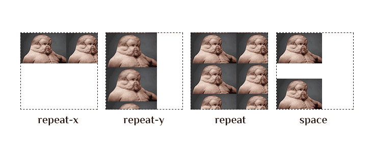
Background Repeat
Background Attachment
Background Shorthand
CSS Borders
Borders
Border Width
Border Color
Border Sides
Border Shorthand
Rounded Borders
CSS Margins
Margins
Margin Collapse
CSS PaddingCSS Height/WidthCSS Box ModelCSS Outline
Outline
Outline Width
Outline Color
Outline Shorthand
Outline Offset
CSS Text
Text Color
Text Alignment
Text Decoration
Text Transformation
Text Spacing
Text Shadow
CSS Fonts
Font Family
Font Web Safe
Font Fallbacks
Font Style
Font Size
Font Google
Font Pairings
Font Shorthand
CSS IconsCSS LinksCSS ListsCSS Tables
Table Borders
Table Size
Table Alignment
Table Style
Table Responsive
CSS DisplayCSS Max-widthCSS PositionCSS OverflowCSS Float
Float
Clear
Float Examples
CSS Inline-blockCSS AlignCSS CombinatorsCSS Pseudo-classCSS Pseudo-elementCSS OpacityCSS Navigation Bar
Navbar
Vertical Navbar
Horizontal Navbar
CSS DropdownsCSS Image GalleryCSS Image SpritesCSS Attr SelectorsCSS FormsCSS CountersCSS Website LayoutCSS UnitsCSS SpecificityCSS !important
Указание ключевых кадров анимации
Вы можете указывать ключевые кадры анимации в определенных точках анимации. Это указывается с помощью , при этом нужно указать произвольное название анимации и перечислить список правил.
Имя анимации вы указываете своё, его в дальнейшем мы будет использовать внутри свойства .
Правила задаются с указанием ключевых кадров в процентах или с указанием ключевых свойств и .
— название анимации для элемента
Указывает список анимаций применяемых для элемента. Здесь вам нужно указать названия анимаций которые вы хотели бы применить для выбранного элемента.
— продолжительность анимации
Данное свойство позволяет задавать продолжительность анимации. Значение указывается в секундах или миллисекундах.
— направление анимации
Свойство определяет, должна ли анимация воспроизводиться в обратном порядке в некоторых или во всех циклах. Когда анимация воспроизводится в обратном порядке, временные функции также меняются местами. Например, при воспроизведении в обратном порядке функция будет вести себя как .
| Все повторы анимации воспроизводятся так, как указано. Значение по умолчанию. | |
| Все повторы анимации воспроизводятся в обратном направлении от того, как они были определены. | |
| Каждый нечетный повтор цикла анимации воспроизводятся в нормальном направлении, каждый четный повтор воспроизводится в обратном направлении. | |
| Каждый нечетный повтор цикла анимации воспроизводятся в обратном направлении, каждый четный повтор воспроизводится в нормальном направлении. | |
| Устанавливает значение свойства в значение по умолчанию. | |
| Наследует значение свойства от родительского элемента. |
— свойство для управления работой функции
С помощь данного свойства вы можете останавливать и запускать функцию указывая определенные значения.
Вы можете прописать данное свойство для псевдокласса и останавливать анимацию после наведения курсора на элемент.
CSS Properties
align-contentalign-itemsalign-selfallanimationanimation-delayanimation-directionanimation-durationanimation-fill-modeanimation-iteration-countanimation-nameanimation-play-stateanimation-timing-functionbackface-visibilitybackgroundbackground-attachmentbackground-blend-modebackground-clipbackground-colorbackground-imagebackground-originbackground-positionbackground-repeatbackground-sizeborderborder-bottomborder-bottom-colorborder-bottom-left-radiusborder-bottom-right-radiusborder-bottom-styleborder-bottom-widthborder-collapseborder-colorborder-imageborder-image-outsetborder-image-repeatborder-image-sliceborder-image-sourceborder-image-widthborder-leftborder-left-colorborder-left-styleborder-left-widthborder-radiusborder-rightborder-right-colorborder-right-styleborder-right-widthborder-spacingborder-styleborder-topborder-top-colorborder-top-left-radiusborder-top-right-radiusborder-top-styleborder-top-widthborder-widthbottombox-decoration-breakbox-shadowbox-sizingbreak-afterbreak-beforebreak-insidecaption-sidecaret-color@charsetclearclipclip-pathcolorcolumn-countcolumn-fillcolumn-gapcolumn-rulecolumn-rule-colorcolumn-rule-stylecolumn-rule-widthcolumn-spancolumn-widthcolumnscontentcounter-incrementcounter-resetcursordirectiondisplayempty-cellsfilterflexflex-basisflex-directionflex-flowflex-growflex-shrinkflex-wrapfloatfont@font-facefont-familyfont-feature-settingsfont-kerningfont-sizefont-size-adjustfont-stretchfont-stylefont-variantfont-variant-capsfont-weightgapgridgrid-areagrid-auto-columnsgrid-auto-flowgrid-auto-rowsgrid-columngrid-column-endgrid-column-gapgrid-column-startgrid-gapgrid-rowgrid-row-endgrid-row-gapgrid-row-startgrid-templategrid-template-areasgrid-template-columnsgrid-template-rowshanging-punctuationheighthyphens@importisolationjustify-content@keyframesleftletter-spacingline-heightlist-stylelist-style-imagelist-style-positionlist-style-typemarginmargin-bottommargin-leftmargin-rightmargin-topmax-heightmax-width@mediamin-heightmin-widthmix-blend-modeobject-fitobject-positionopacityorderoutlineoutline-coloroutline-offsetoutline-styleoutline-widthoverflowoverflow-xoverflow-ypaddingpadding-bottompadding-leftpadding-rightpadding-toppage-break-afterpage-break-beforepage-break-insideperspectiveperspective-originpointer-eventspositionquotesresizerightrow-gapscroll-behaviortab-sizetable-layouttext-aligntext-align-lasttext-decorationtext-decoration-colortext-decoration-linetext-decoration-styletext-indenttext-justifytext-overflowtext-shadowtext-transformtoptransformtransform-origintransform-styletransitiontransition-delaytransition-durationtransition-propertytransition-timing-functionunicode-bidiuser-selectvertical-alignvisibilitywhite-spacewidthword-breakword-spacingword-wrapwriting-modez-index
CSS Reference
CSS ReferenceCSS Browser SupportCSS SelectorsCSS FunctionsCSS Reference AuralCSS Web Safe FontsCSS Font FallbacksCSS AnimatableCSS UnitsCSS PX-EM ConverterCSS ColorsCSS Color ValuesCSS Default ValuesCSS Entities
CSS Properties
align-content
align-items
align-self
all
animation
animation-delay
animation-direction
animation-duration
animation-fill-mode
animation-iteration-count
animation-name
animation-play-state
animation-timing-function
backface-visibility
background
background-attachment
background-blend-mode
background-clip
background-color
background-image
background-origin
background-position
background-repeat
background-size
border
border-bottom
border-bottom-color
border-bottom-left-radius
border-bottom-right-radius
border-bottom-style
border-bottom-width
border-collapse
border-color
border-image
border-image-outset
border-image-repeat
border-image-slice
border-image-source
border-image-width
border-left
border-left-color
border-left-style
border-left-width
border-radius
border-right
border-right-color
border-right-style
border-right-width
border-spacing
border-style
border-top
border-top-color
border-top-left-radius
border-top-right-radius
border-top-style
border-top-width
border-width
bottom
box-decoration-break
box-shadow
box-sizing
break-after
break-before
break-inside
caption-side
caret-color
@charset
clear
clip
clip-path
color
column-count
column-fill
column-gap
column-rule
column-rule-color
column-rule-style
column-rule-width
column-span
column-width
columns
content
counter-increment
counter-reset
cursor
direction
display
empty-cells
filter
flex
flex-basis
flex-direction
flex-flow
flex-grow
flex-shrink
flex-wrap
float
font
@font-face
font-family
font-feature-settings
font-kerning
font-size
font-size-adjust
font-stretch
font-style
font-variant
font-variant-caps
font-weight
gap
grid
grid-area
grid-auto-columns
grid-auto-flow
grid-auto-rows
grid-column
grid-column-end
grid-column-gap
grid-column-start
grid-gap
grid-row
grid-row-end
grid-row-gap
grid-row-start
grid-template
grid-template-areas
grid-template-columns
grid-template-rows
hanging-punctuation
height
hyphens
@import
isolation
justify-content
@keyframes
left
letter-spacing
line-height
list-style
list-style-image
list-style-position
list-style-type
margin
margin-bottom
margin-left
margin-right
margin-top
max-height
max-width
@media
min-height
min-width
mix-blend-mode
object-fit
object-position
opacity
order
outline
outline-color
outline-offset
outline-style
outline-width
overflow
overflow-x
overflow-y
padding
padding-bottom
padding-left
padding-right
padding-top
page-break-after
page-break-before
page-break-inside
perspective
perspective-origin
pointer-events
position
quotes
resize
right
row-gap
scroll-behavior
tab-size
table-layout
text-align
text-align-last
text-decoration
text-decoration-color
text-decoration-line
text-decoration-style
text-indent
text-justify
text-overflow
text-shadow
text-transform
top
transform
transform-origin
transform-style
transition
transition-delay
transition-duration
transition-property
transition-timing-function
unicode-bidi
user-select
vertical-align
visibility
white-space
width
word-break
word-spacing
word-wrap
writing-mode
z-index


