Как работать с фоновыми картинками в css
Содержание:
Управление позицией фонового изображения
По умолчанию, фоновое изображение позиционируется в верхнем левом углу элемента, используя CSS свойство background-position мы можем изменить это положение с использованием единиц измерения CSS, либо используя ключевые слова:
| Значение | Описание |
|---|---|
| left topleft centerleft bottomright topright centerright bottomcenter topcenter centercenter bottom | Задает положение изображения. Первое значение-горизонтальное положение, а второе значение вертикальное. Если вы указываете только одно ключевое слово, другое значение будет «center» |
| x% y% | Задает положение изображения. Первое значение — горизонтальное положение, а второе значение вертикальное. Левый верхний угол имеет 0% 0% (это значение по умолчанию). В правом нижнем углу 100% 100%. Если указано только одно значение, то другое значение будет 50%. |
| x y | Задает положение изображения. Первое значение — горизонтальное положение, а второе значение вертикальное. Левый верхний угол имеет 0 0. Значения могут быть в пикселях, или других единицах измерения CSS. Если указано только одно значение, то другое значение будет 50%. Вы можете совместно использовать проценты и единицы измерения. |
Рассмотрим пример использования этого свойства:
<!DOCTYPE html>
<html>
<head>
	<title>Пример позиционирования фонового изображения</title>
<style>
div {
display: inline-block; /* устанавливаем, что элементы становятся блочно-строчными (чтобы выстроились в линейку) */
background-image: url("smile_bg.png"); /* указываем путь к файлу изображения, которое будет использоваться как задний фон */
background-repeat: no-repeat; /**/
width: 100px; /* устанавливаем ширину элемента */
height: 100px; /* устанавливаем высоту элемента */
border: 1px solid; /* устанваливаем сплошную границу размером 1 пиксель */
margin: 10px; /* устанавливаем внешние отступы со всех сторон */
text-align: center; /* выравниваем текст по центру */
line-height: 60px; /* указываем высоту строки */
background-color: azure; /* задаем цвет заднего фона */
}
.leftTop {background-position: left top;} /* задаем позицию ключевыми словами */
.leftCenter {background-position: left center;} /* задаем позицию ключевыми словами */
.leftBottom {background-position: left bottom;} /* задаем позицию ключевыми словами */
.rightTop {background-position: right top;} /* задаем позицию ключевыми словами */
.rightCenter {background-position: right center;} /* задаем позицию ключевыми словами */
.rightBottom {background-position: right bottom;} /* задаем позицию ключевыми словами */
.centerTop {background-position: center top;} /* задаем позицию ключевыми словами */
.centerCenter {background-position: center center;} /* задаем позицию ключевыми словами */
.centerBottom {background-position: center bottom;} /* задаем позицию ключевыми словами */
.userPosition {background-position: 20px 75%;} /* задаем позицию по горизонтали в пикселях, а по вертикали в процентах */
</style>
</head>
	<body>
		<div class = "leftTop">left top</div>
		<div class = "leftCenter">left center</div>
		<div class = "leftBottom">left bottom</div>
		<div class = "rightTop">right top</div>
		<div class = "rightCenter">right center</div>
		<div class = "rightBottom">right bottom</div>
		<div class = "centerTop">center top</div>
		<div class = "centerCenter">center center</div>
		<div class = "centerBottom">center bottom</div>
		<div class = "userPosition">20px 75%</div>
	</body>
</html>
В данном примере, мы создали 10 блоков с различными классами, в которых заданы различные значения, связанные с позиционированием фоновых изображений. Для первых девяти блоков были использованы всевозможные ключевые слова, а для последнего блока было задано значение для горизонтального позиционирования в пикселях, а для вертикального в процентах.
Результат нашего примера:
Рис. 117 Пример позиционирования фонового изображения.
Завершение
Поздравляем, вы только что создали еще одну настоящую адаптивную веб-страницу! Вы можете пойти дальше и преобразить ее по своему вкусу. Придумайте и добавьте новые секции, стилизуйте их, используя свои навыки. Кроме этого, можно создать еще несколько веб-страниц и объединить их с помощью ссылок — получится полноценный многостраничный сайт музыкальной группы!
Если в процессе прохождения урока у вас что-то не получилось, не отчаивайтесь — готовый проект, как всегда, включен в архив с файлами, так что вы можете заглянуть в него и разобраться, в чем проблема.
А вот и демо-версия готовой страницы:
На этой ноте мы завершаем практический урок, а также текущую главу учебника. Спасибо за участие, и оставайтесь с нами: впереди вас ждет следующая глава, которая посвящена вещам, без которых не обойдется ни один сайт — ссылки и навигация. И первый урок посвящен такой теме как состояние ссылок в CSS.
Создание полупрозрачного фона в CSS
Полупрозрачный элемент хорошо заметен на фоновом рисунке. В веб-дизайне полупрозрачность достигается за счёт свойства opacity или задаваемого для фона формата цвета RGBA.
Особенность данного свойства заключается в том, что прозрачность действует не только на фон, но и на все дочерние элементы. После увеличения прозрачности, и текст и фон станут полупрозрачными.
Пример создания полупрозрачного блока:
<!DOCTYPE html>
<html>
 <head>
  <meta charset="utf-8">
  <title>opacity</title>
  <style>
   body {
    background: url("http://cs614726.vk.me/v614726246/4a02/300wj_aFOK4.jpg");
    background-size: 10% auto;
   }
   div {
	 opacity: 0.7;
 	 background: #717ceb; /* Цвет фона */
 	 padding: 20px; /* Поля вокруг текста */
   }
  </style>
 </head>
 <body>
   <div>Так выглядит полупрозрачный блок.</div>
 </body>
</html>
В таком случае opacity не подходит и следует воспользоваться форматом RGBA, в котором помимо значений яркости синего, красного и зелёного цветов устанавливается ещё и значение прозрачности. 1 означает абсолютную непрозрачность, а 0 — полную прозрачность.
Пример задания прозрачного фона:
<!DOCTYPE html>
<html>
 <head>
  <meta charset="utf-8">
  <title>rgba</title>
  <style>
   body {
  background: url("http://cs614726.vk.me/v614726246/4a02/300wj_aFOK4.jpg");
  background-size: 20% auto;
}
   div {
    background: rgba(60, 150, 250, 0.7); /* Цвет фона */
    color: #fff; /* Цвет текста */
    padding: 20px; /* Поля вокруг текста */
   }
  </style>
 </head>
 <body>
  <div>Прозрачный фон блока и непрозрачный текст.</div>
 </body>
</html>
CSS Reference
CSS ReferenceCSS Browser SupportCSS SelectorsCSS FunctionsCSS Reference AuralCSS Web Safe FontsCSS Font FallbacksCSS AnimatableCSS UnitsCSS PX-EM ConverterCSS ColorsCSS Color ValuesCSS Default ValuesCSS Entities
CSS Properties
align-content
align-items
align-self
all
animation
animation-delay
animation-direction
animation-duration
animation-fill-mode
animation-iteration-count
animation-name
animation-play-state
animation-timing-function
backface-visibility
background
background-attachment
background-blend-mode
background-clip
background-color
background-image
background-origin
background-position
background-repeat
background-size
border
border-bottom
border-bottom-color
border-bottom-left-radius
border-bottom-right-radius
border-bottom-style
border-bottom-width
border-collapse
border-color
border-image
border-image-outset
border-image-repeat
border-image-slice
border-image-source
border-image-width
border-left
border-left-color
border-left-style
border-left-width
border-radius
border-right
border-right-color
border-right-style
border-right-width
border-spacing
border-style
border-top
border-top-color
border-top-left-radius
border-top-right-radius
border-top-style
border-top-width
border-width
bottom
box-decoration-break
box-shadow
box-sizing
break-after
break-before
break-inside
caption-side
caret-color
@charset
clear
clip
clip-path
color
column-count
column-fill
column-gap
column-rule
column-rule-color
column-rule-style
column-rule-width
column-span
column-width
columns
content
counter-increment
counter-reset
cursor
direction
display
empty-cells
filter
flex
flex-basis
flex-direction
flex-flow
flex-grow
flex-shrink
flex-wrap
float
font
@font-face
font-family
font-feature-settings
font-kerning
font-size
font-size-adjust
font-stretch
font-style
font-variant
font-variant-caps
font-weight
gap
grid
grid-area
grid-auto-columns
grid-auto-flow
grid-auto-rows
grid-column
grid-column-end
grid-column-gap
grid-column-start
grid-gap
grid-row
grid-row-end
grid-row-gap
grid-row-start
grid-template
grid-template-areas
grid-template-columns
grid-template-rows
hanging-punctuation
height
hyphens
@import
isolation
justify-content
@keyframes
left
letter-spacing
line-height
list-style
list-style-image
list-style-position
list-style-type
margin
margin-bottom
margin-left
margin-right
margin-top
max-height
max-width
@media
min-height
min-width
mix-blend-mode
object-fit
object-position
opacity
order
outline
outline-color
outline-offset
outline-style
outline-width
overflow
overflow-x
overflow-y
padding
padding-bottom
padding-left
padding-right
padding-top
page-break-after
page-break-before
page-break-inside
perspective
perspective-origin
pointer-events
position
quotes
resize
right
row-gap
scroll-behavior
tab-size
table-layout
text-align
text-align-last
text-decoration
text-decoration-color
text-decoration-line
text-decoration-style
text-indent
text-justify
text-overflow
text-shadow
text-transform
top
transform
transform-origin
transform-style
transition
transition-delay
transition-duration
transition-property
transition-timing-function
unicode-bidi
user-select
vertical-align
visibility
white-space
width
word-break
word-spacing
word-wrap
writing-mode
z-index
BACKGROUND-CLIP
Это свойство действует аналогично , в том смысле, что позиционирование происходит относительно тех же точек. Но здесь в отличие от позиционируется та область фона, которая будет обрезана.
CSS
.item-1{
background-image: url(graham.jpg);
background-origin: border-box;
background-clip: border-box;
background-color: grey;
background-repeat: no-repeat;
border: 10px dashed #8e1d21;
padding: 20px;
}
.item-2 { background-clip: padding-box; /* Остальные стили как у .item-1 */ }
.item-3 { background-clip: content-box; /* Остальные стили как у .item-1 */ }
|
1 |
.item-1{ background-imageurl(graham.jpg); background-originborder-box; background-clipborder-box; background-colorgrey; background-repeatno-repeat; border10pxdashed#8e1d21; padding20px; } .item-2 {background-clippadding-box;/* Остальные стили как у .item-1 */} .item-3 {background-clipcontent-box;/* Остальные стили как у .item-1 */} |
Перевод статьи: https://bitsofco.de/the-background-properties/
твиттерефейсбуке
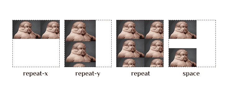
Повторение фоновых картинок background-repeat
Свойство предназначено для управления повторением фоновой картинки. Является не наследуемым.
| background-repeat | |
|---|---|
| Значения: | |
| При таком параметре фон повторяется многократно во все направлениях. При заданном правиле , повторение фонового имиджа осуществляется с учетом позиции. Является дефолтным | |
| Без повторения. | |
| Повторение слева направо вдоль воображаемой горизонтальной оси координат. | |
| Повторение сверху вниз право вдоль воображаемой вертикальной оси координат. | |
| Переводит в дефолтное состояние. | |
| При выборе этой опции, данное правило будет унаследовано от родителя. |
Формат записи
Property Values
| Value | Description | CSS |
|---|---|---|
| background-color | Specifies the background color to be used | 1 |
| background-image | Specifies ONE or MORE background images to be used | 1 |
| background-position | Specifies the position of the background images | 1 |
| background-size | Specifies the size of the background images | 3 |
| background-repeat | Specifies how to repeat the background images | 1 |
| background-origin | Specifies the positioning area of the background images | 3 |
| background-clip | Specifies the painting area of the background images | 3 |
| background-attachment | Specifies whether the background images are fixed or scrolls with the rest of the page | 1 |
| initial | Sets this property to its default value. Read about initial | 3 |
| inherit | Inherits this property from its parent element. Read about inherit | 2 |
CSS Properties
align-contentalign-itemsalign-selfallanimationanimation-delayanimation-directionanimation-durationanimation-fill-modeanimation-iteration-countanimation-nameanimation-play-stateanimation-timing-functionbackface-visibilitybackgroundbackground-attachmentbackground-blend-modebackground-clipbackground-colorbackground-imagebackground-originbackground-positionbackground-repeatbackground-sizeborderborder-bottomborder-bottom-colorborder-bottom-left-radiusborder-bottom-right-radiusborder-bottom-styleborder-bottom-widthborder-collapseborder-colorborder-imageborder-image-outsetborder-image-repeatborder-image-sliceborder-image-sourceborder-image-widthborder-leftborder-left-colorborder-left-styleborder-left-widthborder-radiusborder-rightborder-right-colorborder-right-styleborder-right-widthborder-spacingborder-styleborder-topborder-top-colorborder-top-left-radiusborder-top-right-radiusborder-top-styleborder-top-widthborder-widthbottombox-decoration-breakbox-shadowbox-sizingbreak-afterbreak-beforebreak-insidecaption-sidecaret-color@charsetclearclipclip-pathcolorcolumn-countcolumn-fillcolumn-gapcolumn-rulecolumn-rule-colorcolumn-rule-stylecolumn-rule-widthcolumn-spancolumn-widthcolumnscontentcounter-incrementcounter-resetcursordirectiondisplayempty-cellsfilterflexflex-basisflex-directionflex-flowflex-growflex-shrinkflex-wrapfloatfont@font-facefont-familyfont-feature-settingsfont-kerningfont-sizefont-size-adjustfont-stretchfont-stylefont-variantfont-variant-capsfont-weightgapgridgrid-areagrid-auto-columnsgrid-auto-flowgrid-auto-rowsgrid-columngrid-column-endgrid-column-gapgrid-column-startgrid-gapgrid-rowgrid-row-endgrid-row-gapgrid-row-startgrid-templategrid-template-areasgrid-template-columnsgrid-template-rowshanging-punctuationheighthyphens@importisolationjustify-content@keyframesleftletter-spacingline-heightlist-stylelist-style-imagelist-style-positionlist-style-typemarginmargin-bottommargin-leftmargin-rightmargin-topmax-heightmax-width@mediamin-heightmin-widthmix-blend-modeobject-fitobject-positionopacityorderoutlineoutline-coloroutline-offsetoutline-styleoutline-widthoverflowoverflow-xoverflow-ypaddingpadding-bottompadding-leftpadding-rightpadding-toppage-break-afterpage-break-beforepage-break-insideperspectiveperspective-originpointer-eventspositionquotesresizerightrow-gapscroll-behaviortab-sizetable-layouttext-aligntext-align-lasttext-decorationtext-decoration-colortext-decoration-linetext-decoration-styletext-indenttext-justifytext-overflowtext-shadowtext-transformtoptransformtransform-origintransform-styletransitiontransition-delaytransition-durationtransition-propertytransition-timing-functionunicode-bidiuser-selectvertical-alignvisibilitywhite-spacewidthword-breakword-spacingword-wrapwriting-modez-index
Значения свойства
| Значение | Описание |
|---|---|
| background-color | Определяет цвет фона (HEX, RGB, RGBA, HSL, HSLA, «Предопределённые цвета»). |
| background-image | Задает одно или несколько фоновых изображений для элемента. |
| background-position | Задает положение (позицию) фонового изображения. |
| background-size | Определяет размер фонового изображения/-ий. |
| background-repeat | Устанавливает, как фоновое изображение будет повторяться. |
| background-origin | Определяет область позиционирования фонового изображения/-ий. |
| background-clip | Определяет область рисования фона. |
| background-attachment | Устанавливает, поведение фонового изображения во время прокрутки (фиксированное или прокручивается с остальной частью страницы). |
| initial | Устанавливает свойство в значение по умолчанию. |
| inherit | Указывает, что значение наследуется от родительского элемента. |
Property Values
| Value | Description | Play it |
|---|---|---|
| auto | Default value. The background image is displayed in its original size | Play it » |
| length | Sets the width and height of the background image. The first value sets the width, the second value sets the height. If only one value is given, the second is set to «auto». Read about length units | Play it » |
| percentage | Sets the width and height of the background image in percent of the parent element. The first value sets the width, the second value sets the height. If only one value is given, the second is set to «auto» | Play it » |
| cover | Resize the background image to cover the entire container, even if it has to stretch the image or cut a little bit off one of the edges |
Play it » |
| contain | Resize the background image to make sure the image is fully visible | Play it » |
| initial | Sets this property to its default value. Read about initial | Play it » |
| inherit | Inherits this property from its parent element. Read about inherit |
More Examples
Example
A background-image that will scroll with the page (scroll). This is default:
body {
background-image: url(«img_tree.gif»);
background-repeat: no-repeat;
background-attachment: scroll;
}
Example
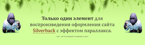
How to create a simple parallax scrolling effect (create an illusion of 3D depth):
.fixed-bg { /* The background image */ background-image: url(«img_tree.gif»);
/* Set a specified height, or the minimum height for the background image */
min-height: 500px; /* Set background image to fixed (don’t scroll along with the page) */
background-attachment: fixed; /* Center the background image */
background-position: center; /* Set the background image to no repeat */
background-repeat: no-repeat; /* Scale the background image to be as large as possible */
background-size: cover;}
More Examples
Example
Specify the size of a background image with percent:
#example1 { background: url(mountain.jpg); background-repeat: no-repeat; background-size: 100%
100%;}
#example2 { background: url(mountain.jpg); background-repeat: no-repeat; background-size: 75%
50%;}
Example
Specify the size of a background image with «cover»:
#example1 { background: url(mountain.jpg);
background-repeat: no-repeat; background-size: cover;
}
Example
Specify the size of a background image with «contain»:
#example1 { background: url(mountain.jpg); background-repeat: no-repeat;
background-size:
contain;}
Example
Here we have two background images. We specify the size of the first background image with «contain»,
and the second background-image with «cover»:
#example1 { background: url(img_tree.gif), url(mountain.jpg);
background-repeat: no-repeat; background-size:
contain, cover;}
Example
Use different background properties to create a «hero» image:
.hero-image { background-image: url(«photographer.jpg»); /* The
image used */ background-color: #cccccc; /* Used if the image is
unavailable */ height: 500px; /* You must set a specified height */
background-position: center; /* Center the image */
background-repeat: no-repeat; /* Do not repeat the image */
background-size: cover; /* Resize the background image to cover the entire container */}
CSS Properties
align-contentalign-itemsalign-selfallanimationanimation-delayanimation-directionanimation-durationanimation-fill-modeanimation-iteration-countanimation-nameanimation-play-stateanimation-timing-functionbackface-visibilitybackgroundbackground-attachmentbackground-blend-modebackground-clipbackground-colorbackground-imagebackground-originbackground-positionbackground-repeatbackground-sizeborderborder-bottomborder-bottom-colorborder-bottom-left-radiusborder-bottom-right-radiusborder-bottom-styleborder-bottom-widthborder-collapseborder-colorborder-imageborder-image-outsetborder-image-repeatborder-image-sliceborder-image-sourceborder-image-widthborder-leftborder-left-colorborder-left-styleborder-left-widthborder-radiusborder-rightborder-right-colorborder-right-styleborder-right-widthborder-spacingborder-styleborder-topborder-top-colorborder-top-left-radiusborder-top-right-radiusborder-top-styleborder-top-widthborder-widthbottombox-decoration-breakbox-shadowbox-sizingbreak-afterbreak-beforebreak-insidecaption-sidecaret-color@charsetclearclipclip-pathcolorcolumn-countcolumn-fillcolumn-gapcolumn-rulecolumn-rule-colorcolumn-rule-stylecolumn-rule-widthcolumn-spancolumn-widthcolumnscontentcounter-incrementcounter-resetcursordirectiondisplayempty-cellsfilterflexflex-basisflex-directionflex-flowflex-growflex-shrinkflex-wrapfloatfont@font-facefont-familyfont-feature-settingsfont-kerningfont-sizefont-size-adjustfont-stretchfont-stylefont-variantfont-variant-capsfont-weightgapgridgrid-areagrid-auto-columnsgrid-auto-flowgrid-auto-rowsgrid-columngrid-column-endgrid-column-gapgrid-column-startgrid-gapgrid-rowgrid-row-endgrid-row-gapgrid-row-startgrid-templategrid-template-areasgrid-template-columnsgrid-template-rowshanging-punctuationheighthyphens@importisolationjustify-content@keyframesleftletter-spacingline-heightlist-stylelist-style-imagelist-style-positionlist-style-typemarginmargin-bottommargin-leftmargin-rightmargin-topmax-heightmax-width@mediamin-heightmin-widthmix-blend-modeobject-fitobject-positionopacityorderoutlineoutline-coloroutline-offsetoutline-styleoutline-widthoverflowoverflow-xoverflow-ypaddingpadding-bottompadding-leftpadding-rightpadding-toppage-break-afterpage-break-beforepage-break-insideperspectiveperspective-originpointer-eventspositionquotesresizerightrow-gapscroll-behaviortab-sizetable-layouttext-aligntext-align-lasttext-decorationtext-decoration-colortext-decoration-linetext-decoration-styletext-indenttext-justifytext-overflowtext-shadowtext-transformtoptransformtransform-origintransform-styletransitiontransition-delaytransition-durationtransition-propertytransition-timing-functionunicode-bidiuser-selectvertical-alignvisibilitywhite-spacewidthword-breakword-spacingword-wrapwriting-modez-index
CSS Syntax
background: bg-color bg-image position/bg-size bg-repeat bg-origin bg-clip bg-attachment initial|inherit;
Note: If one of the properties in the shorthand declaration is the bg-size property,
you must use a / (slash) to separate it from the bg-position property, e.g. background:url(smiley.gif) 10px 20px/50px 50px;
will result in a background image, positioned 10 pixels from the left, 20 pixels from the top, and the size of the image will be 50 pixels wide and 50 pixels high.
Note: If using multiple background-image sources but also
want a background-color, the background-color parameter needs to be last in the
list.
CSS Reference
CSS ReferenceCSS Browser SupportCSS SelectorsCSS FunctionsCSS Reference AuralCSS Web Safe FontsCSS Font FallbacksCSS AnimatableCSS UnitsCSS PX-EM ConverterCSS ColorsCSS Color ValuesCSS Default ValuesCSS Entities
CSS Properties
align-content
align-items
align-self
all
animation
animation-delay
animation-direction
animation-duration
animation-fill-mode
animation-iteration-count
animation-name
animation-play-state
animation-timing-function
backface-visibility
background
background-attachment
background-blend-mode
background-clip
background-color
background-image
background-origin
background-position
background-repeat
background-size
border
border-bottom
border-bottom-color
border-bottom-left-radius
border-bottom-right-radius
border-bottom-style
border-bottom-width
border-collapse
border-color
border-image
border-image-outset
border-image-repeat
border-image-slice
border-image-source
border-image-width
border-left
border-left-color
border-left-style
border-left-width
border-radius
border-right
border-right-color
border-right-style
border-right-width
border-spacing
border-style
border-top
border-top-color
border-top-left-radius
border-top-right-radius
border-top-style
border-top-width
border-width
bottom
box-decoration-break
box-shadow
box-sizing
break-after
break-before
break-inside
caption-side
caret-color
@charset
clear
clip
clip-path
color
column-count
column-fill
column-gap
column-rule
column-rule-color
column-rule-style
column-rule-width
column-span
column-width
columns
content
counter-increment
counter-reset
cursor
direction
display
empty-cells
filter
flex
flex-basis
flex-direction
flex-flow
flex-grow
flex-shrink
flex-wrap
float
font
@font-face
font-family
font-feature-settings
font-kerning
font-size
font-size-adjust
font-stretch
font-style
font-variant
font-variant-caps
font-weight
gap
grid
grid-area
grid-auto-columns
grid-auto-flow
grid-auto-rows
grid-column
grid-column-end
grid-column-gap
grid-column-start
grid-gap
grid-row
grid-row-end
grid-row-gap
grid-row-start
grid-template
grid-template-areas
grid-template-columns
grid-template-rows
hanging-punctuation
height
hyphens
@import
isolation
justify-content
@keyframes
left
letter-spacing
line-height
list-style
list-style-image
list-style-position
list-style-type
margin
margin-bottom
margin-left
margin-right
margin-top
max-height
max-width
@media
min-height
min-width
mix-blend-mode
object-fit
object-position
opacity
order
outline
outline-color
outline-offset
outline-style
outline-width
overflow
overflow-x
overflow-y
padding
padding-bottom
padding-left
padding-right
padding-top
page-break-after
page-break-before
page-break-inside
perspective
perspective-origin
pointer-events
position
quotes
resize
right
row-gap
scroll-behavior
tab-size
table-layout
text-align
text-align-last
text-decoration
text-decoration-color
text-decoration-line
text-decoration-style
text-indent
text-justify
text-overflow
text-shadow
text-transform
top
transform
transform-origin
transform-style
transition
transition-delay
transition-duration
transition-property
transition-timing-function
unicode-bidi
user-select
vertical-align
visibility
white-space
width
word-break
word-spacing
word-wrap
writing-mode
z-index
Иконка соцсети без текста
Почти на любом сайте есть блок со ссылками на Facebook, «ВКонтакте», Instagram и другие соцсети:
Поскольку это иконки, а текста (контентной составляющей) мы рядом не видим, — нужно использовать CSS.
Здесь есть пара нюансов:
- Раз текста нет, то у ссылки нет размеров. А фона без размеров не бывает (нельзя покрасить стену, когда самой стены нет).
- Если мы зададим размеры ссылке, то они не сработают, так как по умолчанию ссылка — строчный элемент (его размер не изменить с помощью свойств width и height).
Обойдём эти ограничения.
Сперва напишем простую разметку — список ссылок. Классы сделаем по БЭМ, чтобы наш компонент было удобно стилизовать и использовать повторно.
Начнём, конечно, с HTML-кода:
Далее — CSS:
- Заметьте, что свойству display для ссылок мы задали значение inline-block. Поэтому наши ссылки стали строчно-блочными элементами. Теперь можно задать им ширину и высоту — и это уже сработает.
- Одинаковые для всех элементов стили (background-position, background-size, background-repeat) мы вынесли в общий класс social__link.
- А вот фоновые изображения у нас разные — их мы задаём в разных классах.
Проверка адаптивности
Без чего невозможно представить современный сайт? Верно, без адаптивных свойств. В наше время оформление мобильной версии сайта часто является даже более важным пунктом, чем наличие удобной десктопной версии.
Давайте проверим, как отображается наша новая веб-страница при разной ширине вьюпорта. Для большего удобства вы можете воспользоваться режимом имитации девайсов в браузере Google Chrome — удобный инструмент, при котором вы словно просматриваете сайт с iPhone, iPad и т. п.
Первое, что бросается в глаза — последний пункт верхнего меню переносится вниз на экранах шириной менее 480 пикселей. Мы можем немного уменьшить горизонтальные отступы у ссылок для этой категории девайсов, используя медиазапрос :
/* разместите этот код последним */

@media (max-width: 480px) {
    .menu li a {
        padding-left: 5px;
        padding-right: 5px;
    }
    .menu {
        text-align: center; /* центрируем меню — так смотрится лучше */
    }
}
За счет сжатия отступов все пункты теперь помещаются в одну строку даже на девайсах с маленькой шириной экрана в 320 пикселей.
Следующий недочет — карточки с городами. Если ширина экрана менее чем 980 пикселей, блоки начинают некрасиво съезжать во второй ряд по левой стороне. Один из вариантов решения данной проблемы — позволить блокам выстраиваться в несколько рядов, но при этом располагаться по центру. Для реализации этой идеи понадобится отменить несколько стилей, заданных ранее. Заметьте, что мы не будем убирать никакой код, а просто используем еще один медиазапрос, который перезапишет стили, если ширина экрана будет меньше 980 пикселей:
/* разместите этот код _над_ прошлым медиазапросом */

@media (max-width: 980px) {
    .tour-card {
        float: none;
        display: inline-block;
    }
    #tour {
        text-align: center;
    }
}
Вкратце о том, что мы сделали. Для начала мы изменили способ выстраивания элементов один за другим: теперь он работает не за счет обтекания , а за счет строчно-блочного поведения карточек. Когда дочерним элементам задано свойство , появляется возможность центрировать их по горизонтали как строчные элементы, добавив к родительскому блоку свойство .
В итоге карточки хоть и переносятся вниз, но выглядят при этом более органично. На узких экранах каждый блок находится под предыдущим, красиво расположившись по центру.
Третья (и последняя) правка адаптивности — это блок подписки на новости. Мы увеличим расстояние между строками текста, добавив свойство элементу (не используя медиазапрос, т. е. разместим это правило среди обычных стилей). А также мы адаптируем стиль кнопки для экранов менее 480 пикселей, сделав ее ширину такой же, как ширина поля , и добавив небольшой отступ сверху.
/* разместите этот код в разделе Subscribe */

#subscribe .pitch p {
    line-height: 1.6;
}

/* а этот — в теле медиазапроса для max-width: 480px */

#subscribe button {
    width: 232px;
    margin-top: 20px;
}
Координаты фонового цвета background-clip
Свойство предназначено для определения местоположения координат фонового цвета относительно внутренней области html-элемента. Является не наследуемым.
| background-clip | |
|---|---|
| Значения: | |
| При такой опции координаты фона вычисляются с учетом бордера. Является дефолтным параметром. | |
| При такой опции координаты фона вычисляются без учета бордера. | |
| Расположение фона начинается относительно границ расположения текстового контента внутри хтмл-блока, к которому данное правило прописано. | |
| Присвоение дефолтного значения. | |
| Информирует интерпретатор цсс-кода браузера, что ему нужно взять значение для данного правила для хтмл-блока у его родителя. |
Формат записи
Определение и применение
CSS свойство background позволяет установить необходимые свойства фона в одном объявлении (универсальное свойство). Значения могут быть указаны в любом порядке (и в любом необходимом количестве), браузер автоматически определит, какое из них соответствует необходимому свойству.
Значения следующих свойств могут быть установлены:
- background-color (color | transparent| initial | inherit).
- background-image (url | none | initial | inherit).
- background-position (значение).
- background-size (auto | length | cover | contain | initial | inherit).
- background-repeat (repeat | repeat-x |repeat-y | no-repeat | initial | inherit).
- background-origin (padding-box | border-box | content-box | initial | inherit).
- background-clip (border-box | padding-box | content-box | initial | inherit).
- background-attachment (scroll | fixed | local | initial | inherit).
Обращаю Ваше внимание на то, что если Вы используете для фона элемента значения position и size вместе, то вы должны при этом разделять их слэшем «/» (position/size). Подробную информацию о работе с задним фоном элементов Вы можете найти в следующей статье учебника:
Подробную информацию о работе с задним фоном элементов Вы можете найти в следующей статье учебника:
«Учебник CSS 3. Статья ‘Работа с фоном элемента в CSS’.»
Property Values
| Value | Description | Play it |
|---|---|---|
| left top left center left bottom right top right center right bottom center top center center center bottom |
If you only specify one keyword, the other value will be «center» | Play it » |
| x% y% | The first value is the horizontal position and the second value is the vertical. The top left corner is 0% 0%. The right bottom corner is 100% 100%. If you only specify one value, the other value will be 50%. . Default value is: 0% 0% |
Play it » |
| xpos ypos | The first value is the horizontal position and the second value is the vertical. The top left corner is 0 0. Units can be pixels (0px 0px) or any other CSS units. If you only specify one value, the other value will be 50%. You can mix % and positions |
Play it » |
| initial | Sets this property to its default value. Read about initial | Play it » |
| inherit | Inherits this property from its parent element. Read about inherit |
Что еще нужно знать про CSS background
Множественные фоны
CSS позволяет использовать множественные фоны, т.е для одного элемента можно задать несколько фоновых изображений и/или градиентов.
Это можно делать либо через универсальное свойство :
Либо через отдельные свойства фона
Множественные фоны накладываются друг на друга как слои, при этом изображение, указанное раньше находится выше, чем изображение, указанное позже, а заливка () всегда находится на самом нижнем слое.
В приведенном ниже примере попробуйте изменить размеры основного элемента (потяните за его правый нижний угол).
Режимы наложения — background-blend-mode
По умолчанию, если у элемента задано и фоновое изображение и цвет заливки, изображение (конечно, если оно непрозрачное) просто перекрывает заливку. С множественными изображениями та же история — верхнее перекрывает нижнее.
В CSS можно указывать режим(ы) наложения фонов. Это делается при помощи свойства , которое поддерживается всеми современными браузерами.
Для всех, кто пользуется Фотошопом или Иллюстратором и знаком с режимами смешивания слоев (Blend Modes), это свойство будет очень кстати. Особенно учитывая, что названия режимов смешивания совпадают с названиями в графических редакторах:
- normal
- multiply
- screen
- overlay
- darken
- lighten
- color-dodge
- color-burn
- hard-light
- soft-light
- difference
- exclusion
- hue
- saturation
- color
- luminosity

